One of the most effective ways to take a bland website and transform it into something beautiful, fresh, and appealing is to use animation. Unfortunately, back in the days when Shockwave and Flash were prominent, using animation and visual effects often meant bogging down the performance of your site. Web animation without Flash is better, faster, and more efficient. That’s why even today a lot of people are afraid to add animation to their websites. However, lag is no longer a problem thanks to several more viable methods including animated GIFs, dynamic HTML, CSS3, Java, and of course HTML5.
In general, animation can be used endlessly to spruce up a site. You can use it to illustrate different content, display advertisements or pop-ups, illuminate navigation panels, liven up a flat page and much more. That said, too many effects and animated elements can end up being a distraction to visitors, so you want to maintain healthy use of it.
If we detailed each and every method for adding animation to a website, this would turn into a book. In addition, there are plenty of resources out there to help you with that – and hopefully as a web developer you know a bit about animation already. Instead, we’re going to take a look at some intuitive and inspiring ways you can use animation to enhance a website.

Animation to Alert
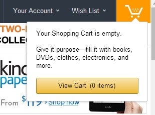
This animation method is great for e-tailers, especially if you have a virtual shopping cart on your website. You can use special effects to notify or alert customers depending on what’s happening. For example, if a customer adds a product to their virtual shopping cart, you can display a drop-down menu with a list of items they are currently going to purchase. Of course, there are plenty of other things you can do with this method, like alerting customers they have a new internal message, they can sign up for a newsletter, or welcoming them if they are a return visitor.
Animation to Instruct
A neat way to offer instructions or additional information is to use a hover effect. This can be combined with images or different design elements. When you hover over an object, text or information will pop-up automatically through simple animation techniques.
Animation to Refresh
You can only fit so much content onto a single page before requiring visitors to move forward. Another handy trick is to use animation to refresh a page or pull new content, so the user can have a seamless browsing experience. This method works great for blogs, social sites or even online storefronts. Behind the scenes, this obviously requires a little more than just flashy animation, but it can really spruce up a site if used properly.
Animation to Direct
When there are a lot of different elements and forms of content on a site, it’s beneficial to help your viewers decide where best to focus their attention. You can use subtle forms of animation to capture a viewer’s eyes with zoom, enlarge, and shift movements. You can also use web animation in elements such as a front page slider, which displays images and content in a recurring cycle. If you don’t already know what a front page slider is, then you probably shouldn’t be here reading this.
Animation to Augment
If you have multiple forms or entry fields, you can use animation to augment the experience for your customers. For example, you can show form progress or even make suggestions as they type. You could also direct them through a form with subtle animation techniques like blinking arrows or sliding indicators.
Animation to Orient
Animation can be used to pan, zoom, move or otherwise orient the user. A great example of this is the animation used by Google Maps when users navigate through the interface. Through innovation, you can use this method for other things too. You could zoom a product image for customers on hover, you could scroll back to the top of a page or even move the focus to another block of content.
Animation to Interact
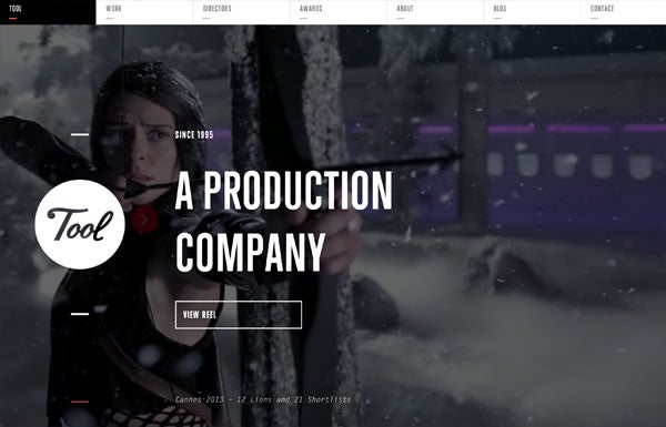
By making use of various information, you can also interact with your customers and visitors through animation. For example, you could make product suggestions to a repeat visitor upon their return. You could also greet customers with custom messages, through pop-ups and notifications. If a customer wants to leave the site, yet there’s still an item in their shopping cart, you could remind them one last time before they’re gone. By interacting with your customers, you’re giving them a more personalized experience – in a way, this shows your visitors that you care. You can also create a more interactive site by using background animation such as what’s used in the example – which is taken from the Tool north america website.
Conclusion
What do you think? Is animation in web design a useful tool or just a shiny toy? Tell us in the comments.


