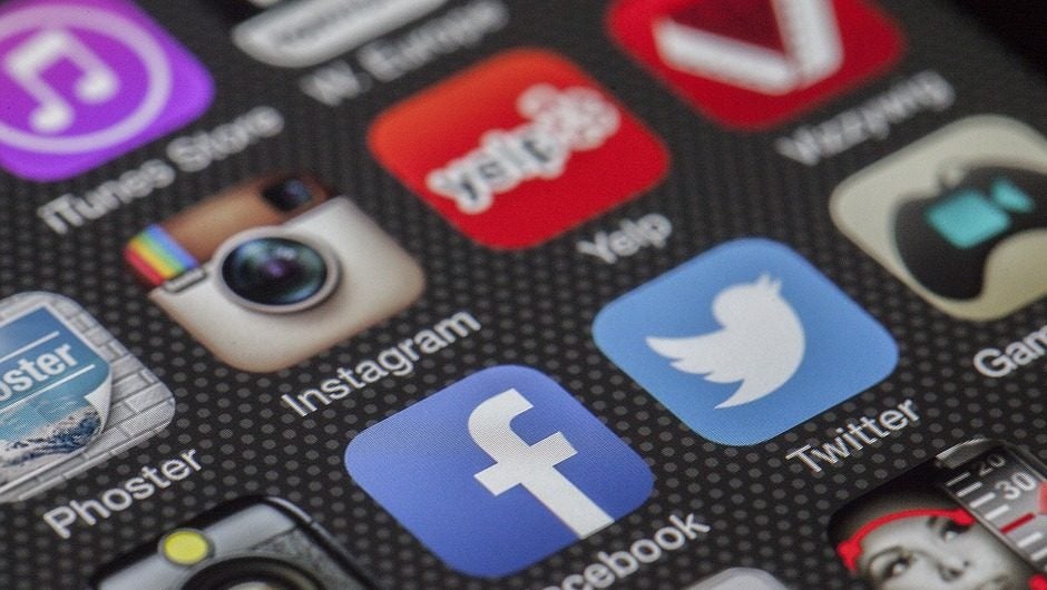
In the ever changing world of social media, few updates drastically change how we interact with them. This week however marks a new notch on the timeline for two massive updates for both Facebook and Twitter, both of which you have undoubtedly already seen. For starters, Facebook has made using GIFs even easier, and Twitter unveiled a new user interface on their website and mobile application.
Facebook Gets GIF
On June 15, 1987 CompuServe unveiled the second globally recognized language on the planet, GIFs. Created by Steve Wilhite, the file format gained popularity due to its widespread support support. Now, 30 years later, Facebook has finally fulfilled a much requested feature, a comment GIF integration. WIth the press of a button users can now open a prompt that will allow you to type in any keyword or phrase and related GIFs will then be presented.
Prior to this update the GIF button was only available on Messenger. According to Facebook, just under 13 billion GIFs have been sent on Messenger in the past year, or an average of 25,000 GIFs per minute. The network also stated that GIF usage has tripled in the past year, with New Year’s Day marking the most popular day for GIFs in their history with more than 400 million sends.
Whether you pronounce it like Wilhite intends (jif – the peanut butter) or with a hard G (ghif), one thing is certain, and that political debates with your high school classmates and distant relatives are about to get a lot more colorful. In other updates Facebook also improved the safety check feature by including optional fundraisers, added closed captions to Facebook Live, and a special Pride reaction for Pride month (don’t have it? Like this page).
Twitter Goes Round
If there is one thing that the internet loves it’s a bandwagon, and Twitter users are having a field day with the network’s new look. What Twitter is describing as a user-centric designed based on feedback and a minimalist feel is basically just the equivalence of moving from squares to circles.
More specifically, Twitter user Yasmine M may have said it best:
#newtwitter Just…WHAT THE DUCK JUST HAPPENED? pic.twitter.com/JBM69FzWU7
— Yasmine Mendes? (@ya_2307) June 15, 2017
So what exactly changed? On mobile, a great deal. On the web mostly just hollow icons, things got more round, and there is now less context on tweets/retweets such as timestamps. Overall the new design is focused on fully embracing what Twitter is for – telling the world what’s happening – and reducing their excessive bird-based branding.
The new look on the mobile app also features a new decluttered side navigation that includes access to profiles, additional accounts, settings, lists, and privacy features. It’s sort of Slack like in nature. In the past Twitter de-focused the use of lists, and by including it in the side navigation it’s clear there was user demand to bring it back. Twitter’s app on iOS now mirrors that of Android in that the lower navigation now only features four icons: home feed, search/explore, notifications, and direct messages.
Beyond structure and navigation, Twitter updated the typography with more bold headers, rounded profile images within tweets that look more similar to a messenger, replaced the solid colored icons for stencils, engagement numbers such as likes now update in real-time, and links to articles and websites now open in Safari’s viewer within the iOS Twitter app.


