Website builder Wix has just revealed the winners of the 2021 Wix Awards, which highlight the best designs for websites.
Wix is one of the biggest website builders out there (and our top pick for the best quality option overall), so the winners come out of a pool big enough to include 100 thousand websites across 190 countries and 72 languages.
Here’s a quick look at the winning website designs, for your viewing and inspiration benefit. We’ve showcased the grand prize winner and our favorites from the other ten finalists in the competition.

Grand Prize: Dopple Press
The Brighton, England-based risograph printing studio Dopple Press takes home the grand prize. Operated by creator Liv White, the site comes with a strong sense of peppy personality.
The whole website‘s packed with cute cartoons and interactive elements that stay engaging without oversaturating the viewer. There’s even a Clippy-inspired paperclip that triggers a support email when clicked.

Finalist: Hors-D’œuvre
Martin, Florian and Guerschon’s French creative studio Hors-D’œuvre chose to prioritize user experience and beautiful photography with their website. That, and lots of basketballs.

Finalist: The Five Fields
A Michelin star restaurant needs a great website: This Chelsea, London eatery rebranded in 2021 with a sleek, minimalist design that evokes their location’s “elegant and intimate” atmosphere.
It’s not a huge diviation from the traditional restaurant website look, but simpler is often better. The business itself has won four AA Rosettes, Squaremeal ‘Restaurant of the Year’, Sunday Times top 100 Restaurants in the UK, ‘Best Gastronomic Experience’ by the Harden’s Guide and AA ‘Wine list of the year,’ so it’s clearly doing a lot right.

Finalist: Festela
Founded by designers Mireia and Merce, the slow fashion brand Festela is based in Barcelona. Each item is handmade and unique, so naturally their website is, too. It’s bold, poppy colors and block lettering are about as far away from a “traditional” design approach as possible, making it a great fit for the brand’s younger audience.

Finalist: Fagerström
Puli Arancibia and Joaquín Pinochet’s independent design studio Fagerström focuses on brand identity, so their own website’s branding is important. Simple black-and-white colors paired with glossy photography is the way to go.

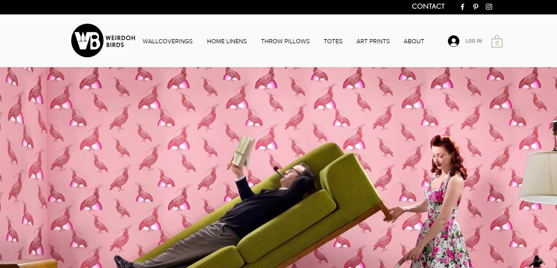
Finalist: Weirdoh Birds
Wix calls Weirdoh Birds a “groovy upscale home decor business,” and they’re right on the money. Orit Harpaz, the visual artist who founded it, decks out the website with fascinating photos of the innovative wall coverings, throw pillows, lamps, and other furnishings. Yes, there are a lot of amazingly weird-looking birds.
All the websites are Wix originals, and showcase the excellent customization options that are one of Wix’s greatest strengths — you can check out the other finalists over here.
Feeling inspired? Check out our full review of the Wix website builder for a full look at the pros and cons behind our favorite pick for crafting an awe-inspiring small business website.


