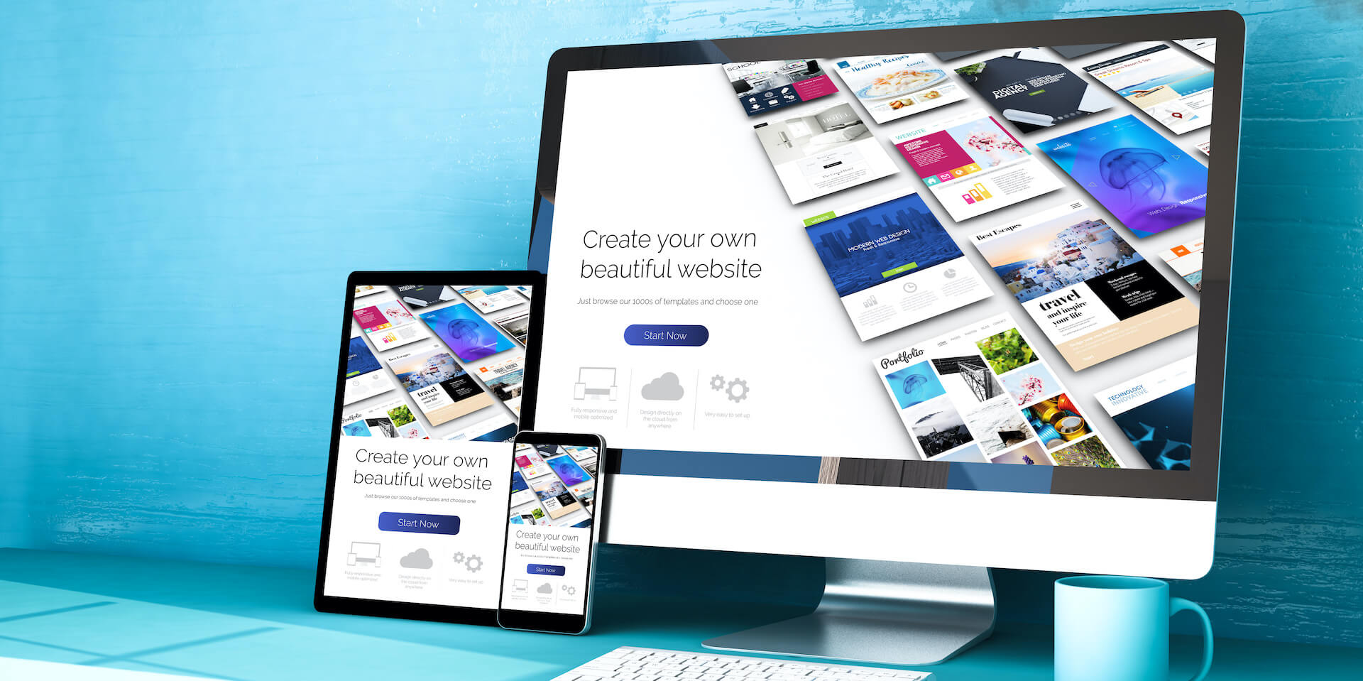
In 2025, building a website is pretty easy. Between the intuitive design interfaces and AI tools that can get you up and running after just a few questions, even the most novice of users can get a site live in just a few minutes.
However, just because it’s easy doesn’t mean you can ignore what makes a good website. After all, everyone in the world has access to these AI website builders, which means you’ll need to follow best practices — like a clear brand vision, simple navigation, and mobile optimization — to ensure that your site stands out.
In this guide, you’ll learn about why good website design is so important, as well as a range of helpful tips to make the best site you can. We even provide some short reviews of our top website builders, so you can get started right away.
Why Is Good Website Design Important?
A well-designed site isn’t just easy on the eye – it has the power to considerably improve business performance and profitability.
Considering web design influences 94% of first impressions, there’s no denying that a website can have a huge impact on your business. So, if you want to make sure that poor design doesn’t drive customers away, taking note of the tips below is in your best interest.
This doesn’t just mean choosing a sleek template and calling it a day: paying attention to details like navigation, typography, color palettes, and images makes users more likely to stay on your site for longer and potentially convert into paying customers.

Squarespace let us filter its professionally designed templates by topic and business type. Source: Tech.co user testing
Prioritizing design also makes it more likely that browsers stumble across your brand in the first place. The relationship between website design and SEO is well documented, and there are a number of actions you can take to help your site show up favorably in the rankings, from making your page responsive to less obvious steps like using high-contrast colors.
These rules don’t just apply to traditional ecommerce businesses. Most types of businesses will benefit from having a well-designed, highly optimized site, from high-street pizza delis to high-end designers. Fortunately, you don’t have to hire a web designer to create a website that converts, but doing your homework doesn’t help.
Follow our tips below for advice on creating a high-performing website. Pressed for time? Jump to our cheat sheet section to find out how to make a site in seven streamlined steps.
What Makes a Good Website? 15 Non-Negotiables
Now, there’s no silver bullet for creating a great website. But if you stick to these 15 principles when creating your next blog, ecommerce site, portfolio, or business website, you’ll find creating a good website is easier than you think.
- Clear purpose – Make sure you know what your site is for, and importantly, not for
- Clear audience – Identify who your site is aimed at
- Straightforward navigation – Prioritize user experience
- Search engine optimization – Create a robust SEO strategy
- The right style – Consider your website’s aesthetics
- Complementary colors – Choose a cohesive color scheme
- High-quality imagery – Don’t cheapen your site with generic, blurry images
- The right fonts – Make sure your font matches the general style, and is legible
- Engaging copy – Use compelling copy to entice your readers
- Fast page speeds – Your visitors (and Google) require fast speeds to keep them engaged
- Sensible sales points – Maximize conversions with compelling call-to-actions
- Mobile first mindset – Make sure your site is responsive on mobiles
- Trust signals – Use a trusted domain to increase your trustworthiness
- Strong security safeguards – Keep your site secure to protect your and your customers’ data
- Multilingual support – If you cater to a global audience, make sure your site is multilingual
1. Clear Purpose
It’s absolutely essential that when you’re building your own website, you understand exactly what your site is going to do. For example, if you’re looking to create a site to sell products, selling products should be your absolute priority. With every decision you make, you should ask yourself – is this going to help users buy my products? Defining a clear purpose takes some time and will impact how long it takes to build a website.
Good website examples include USA Sports. Its website makes it immediately clear that it’s an ecommerce company, and its College Collection display invites viewers to browse its selection of products straight away. The website displays USA Sports’ logo front and center, clearly communicating its brand identity, and its color scheme also draws from its logo, adding to the site’s overall cohesive look.

USA Sports’s website places its products front and center, making its purpose clear for the viewer. Source: USA Sports
USA Sports’s website also uses mixed media to communicate its purpose. For example, it features a video that outlines the company’s discount and reward system, which concludes with a clear CTA. This further incentivizes customers to buy from the company and makes the purpose of the website crystal clear.
2. Clear Audience
Identifying who is going to be using your site is also crucial to building a good website. If you can understand what sort of people are going to be visiting your site, reading your blog posts, buying your products, or taking a look through your previous work, then you can build the site to suit them.
Establishing what your audience looks like is easier than you might think. Start off with good old common sense. For example, if you are selling artisan soap, then your target audience isn’t going to be 15- to 20-year-olds, like Snapchat’s was. Instead, your users might be 30- to 50-year-olds with more disposable income to spend on soap.
Create user personas
One useful tip is to break down your target users into different groups, by creating what is known as a user persona. These are generalized, fictional people who represent a group of users.
The best way to create these personas, especially if you’re just starting out, is to research your market.
- Look at other websites similar to yours: Is there another soap company you’d like to emulate – Burt’s Bees, for example? If so, find out what kind of people visit Burt’s Bees.
- Survey your users, or target users, to find out who they are and what they’re really like.
- Talk to family and friends about your site, its competitors, and the impressions they give.
- If you’ve already made some sales or have an existing readership, then you may have data about your website’s current audience. You can access this through tools like your payment platform or Google Analytics.
Armed with this information, you can adjust your content to either match the needs of your existing audience or attract a new one.
3. Straightforward Navigation
Once you’ve established the purpose of your site and your target audience, your top priority should be improving its user experience (UX) to make it as easy as possible for this audience to get around.
According to research, 79% of website visitors will immediately look for another site if there is a poor user experience. To make sure your audience gets from A to B within this time limit, and without expending too much mental effort, you need to consider your site structure.

SeatGeek’s search bar invites users to search for events and artists, increasing the amount of time they’ll spend on the site. Source: SeatGeek
A good website example that gets its navigation spot on is SeatGeek. The page displays a search bar, which encourages the user to search the site for whatever team, artist, event, or venue they’re looking for, saving them the time it would have taken to find results manually. Using navigation bars like Seak Geek’s – or on-page menus – will significantly improve your website’s user experience, and pretty much guarantee viewers stay on your page for longer.
By contrast, try canceling your Amazon account. There’s no way to close your account from the My Account section, and even on the Contact Us pages, the process isn’t made clear.
Another shortcut to finessing user experience on your site is using Shneiderman’s eight golden rules of interface design. The guidelines were designed to help designers enhance usability across a range of products, and are especially relevant when it comes to web design. The roles are as follows:
- Strive for consistency – Use the same design patterns, color scheme, terminology, and typography across your website to help viewers familiarize themselves quickly.
- Seek universal usability – Ensure your website is accessible to all users, including those with visual, auditory, and cognitive impairments. This can be achieved by adhering to WCAG (Web Content Accessibility Guidelines).
- Offer informative feedback – Provide visual or auditory feedback when users interact with your site. This reassures users that their activity is being registered.
- Design dialogs to yield closure – Clearly indicate when the user has completed an action, by displaying a confirmation message, a notification, or other forms of visual feedback.
- Prevent errors – Anticipate that potential errors may take place on your website, and provide users with straightforward ways to recover from them.
- Permit easy reversal of actions – Allow users to undo actions on your website, such as deleting text, removing items from a card, and canceling checkout processes.
- Keep users in control – To make users feel empowered when using your website, give them the autonomy to take actions, make decisions, and undo errors.
- Reduce short-term memory load – Create a simple yet effective interface, and avoid overwhelming the user with complex design and unnecessary information.
Here at Tech.co, we recommend using website builders to create your own website. The best website builders make it easy to create a navigable site structure, with different page categories and subsections.
4. Search Engine Optimization (SEO)
SEO is the process of improving your website’s ranking in the search engine results page (SERPs) and increasing the quantity and quality of your site traffic as a result. You could have the best-looking website in the world, but if your page doesn’t rank, you’re wasting your time.
Organic search optimization may be more time-intensive than alternative marketing methods like paid search, but it’s much cheaper in the long run. And with organic search delivering 53% of all website traffic, SEO is no longer a trick businesses can afford to miss.
There are three main types of SEO: technical SEO, on-site SEO, and off-site SEO.
- Technical SEO is all about enhancing the technical aspects of a website to make it easier for search engines to crawl and index. Common strategies include improving mobile friendliness, image optimization, general usability, and site speed.
- On-site SEO, or content optimization, requires businesses to optimize their site for people and search engines. To ace this step, content needs to be keyword-rich, original, and error-free, and follow SEO protocol. Fortunately, due to rapidly evolving SEO features, like Wix’s AI mega tag creator, it’s now earlier than ever for you to boost your on-site SEO. Internal linking is also a vital aspect of on-site SEO, a practice where businesses use hyperlinks to connect pages on the same website.
- Off-site SEO considers factors outside of your site, like healthy backlink profiles, social media engagement, and positive customer reviews.
Check out our guide to the best website builders for SEO to learn more

Wix offers a wide range of guides that help us with building our site, like SEO. Source: Tech.co testing
To give your site the best chance of being picked up by search engine algorithms, you’ll need to focus on all three metrics. This may sound like a lot of work, but trust us, it’s worth it.
5. The Right Style
A user’s first impression of a website is 94% related to design. With this in mind, carefully considering your site’s aesthetic – and its relationship to your brand’s message – is a must.
When looking at examples of other websites, Mr. Porter offers a clean, fuss-free style, designed to showcase the high-quality, luxury products it sells and the service it delivers.
Oi Polloi, on the other hand, offers a different proposition – a friendlier face, sure, but it still might feel intimidating to those not familiar with the brand. Oi Polloi’s site is less aloof than Mr. Porter’s, but at the same time, it is specifically designed with an ‘in-crowd’ in mind.

Our Wix site is very customizable, offering lots of design options across every page. Source: Tech.co testing
It’s also worth keeping an eye on general web design trends. For example, scrolling textures and ‘flat’ elements are great design styles to keep your website looking fresh, as well as make it easier to use.
You should try and avoid design styles based on skeuomorphism – a type of design that mimics the style of real things
In general, you should avoid design styles based on skeuomorphism. Skeuomorphic design refers to objects that are designed to mimic the style of real things, whilst offering a different function. This design style isn’t mobile-friendly and can make your website seem kitsch, which could put off some users.
In contrast, it’s advised to opt for flat designs when creating a site, a minimalist user interface design style that uses simpler, two-dimensional images. You don’t need to be an expert to nail your vision either. Tools like Squarespace offer industry-leading design tools that do most of the hard work for you.
6. Complementary Colors
Color is one of the most central components of your website design. In fact, color can increase brand recognition by up to 80%. The same theory applies to your website. Selecting the right palette makes it easier for viewers to remember your site and connect with it on an emotional level.
Being mindful of colors also considerably improves the user experience, increasing dwell time and even conversion rates as a result. You don’t need to be a master in color theory to nail a perfect color palette, either. However, we’d recommend choosing colors that communicate your brand, keeping it relatively simple by using two or three shades and following one of the main types of color schemes below instead of picking at random.

According to Tictoc Digital, websites should use monochromatic, analogous, complementary, or split complementary color schemes. Source: Tictoc Digital
There are also some technical aspects to bear in mind. Choosing low-contrast colors like pink and red can make the text on your site less legible, resulting in a poorer browsing experience for the user. Like using a small font, having low-contrast colors on your site can make your page less optimized for search engines, so it is important to make sure that your choice of colors isn’t too overwhelming, and that they make the text on your page as legible as possible.
7. High-Quality Imagery
Once you’ve got your site’s general design nailed down, it’s time to move on to the individual design components.
All the best websites feature images, and whether it’s to showcase products they’re selling, create a certain mood, or illustrate something else, they need to be high quality, particularly for artists creating their own websites to sell or showcase art.
Blurry images, or an overreliance on joyless stock images, will make a website seem amateurish. Instead, you should pick a style and stick to it. Take a look at the images on Apple’s site. They are all clear images that reflect the brand and are targeted towards the users of that specific product.
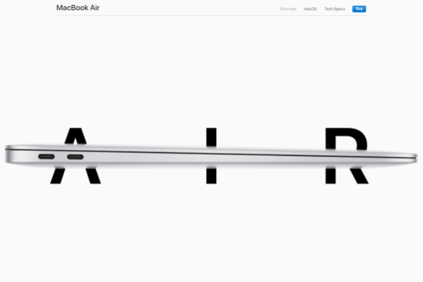

For example, the MacBook Air’s page features images on a light-colored background to emphasize that the device is light and transportable. The Mac Mini, on the other hand, uses darker, moodier images to reinforce that it’s a powerful device for professionals (If you do use a Mac, find out why Wix is the best Mac website builder here).
You’ll also want to know the best practices for keeping your website disability friendly for those with vision impairments, from alt tags to strong color contrasts.
With the best design score on record, our research and user testing suggest Squarespace is the best website builder for showcasing powerful images and graphics. If you don’t have your own imagery, the platform’s image gallery lets users insert, edit, and format free images from Unsplash or premium images from Getty Images, to enhance the quality of their page, too.
8. The Right Fonts
A typeface might seem relatively inconsequential. However, picking the right font helps to set the correct tone for your website, and can have massive implications on user experience, accessibility, and brand engagement.
Wired and The Guardian, for example, both use serif fonts (the ones with the little lines on the end of each letter) to emphasize that they are serious publishing businesses, with an established presence and serious journalistic weight. However, Wired drops the serif fonts in its headings and standfirsts. Why? To make the biggest impression on the page. Sans-serif fonts are typically more attention-grabbing and easier to read.

The Verge uses a variety of different fonts, all with unique purposes. Source: The Verge
When building your site, you should try out different font styles to find the right one. Remember to always keep your site’s purpose and users in mind. And if you’re unsure where to start, look at your favorite sites to gather ideas for a website.
Opting for unusual, heavily stylized fonts is fine for brand names, but you don’t want long paragraphs of text in cursive-style fonts. For instance, the example website Four Eyes uses a mixture of Mr De Haviland and Rosewood for its header fonts, creating a chaotic overall impression for the viewer. If you’re serious about the user experience of your viewers, you’d want to avoid making font choices like this at all costs.
9. Engaging Copy
So, you’ve picked your design, you’ve got your images sorted, and you’ve found the right font (or fonts). Now you need to fill your site with the right words.
Again, users and purpose are at the forefront of any copy you craft for your site. You’ll want to make sure it’s engaging, easy to read, and has a consistent tone. If one page on your website is written in the style of a Buzzfeed listicle and the next page is written like a legal contract, your users will be confused and turned off by your site.
Make sure your copy is to the point and clear. If you’re selling products, give your users the information they need to know about the product. If you’re trying to drum up customers for your business, consider getting testimonials from other customers and being clear about the service your business provides.
Whatever you’re doing, your copy should point users to an action without overdoing it – whether that’s buying a product, making an appointment, or enquiring about a service.

GoDaddy’s builder includes an AI text generator on all plans. Source: Tech.co testing
Struggling for inspiration? Most builders, like Wix, GoDaddy, and Shopify, include AI text generators to help get the ball rolling when you’re making copy for your website. These tools can provide a lifeline to users who are struggling to get started, but remember to always double-check text created by AI and to edit the content to ensure it’s human-sounding and compelling.
10. Fast Page Speeds
It may seem trivial, but the reality is that every single second counts when it comes to page speeds and retaining visitors. There are literally dozens of stats out there that show customers will leave and never come back to your site for even just a few seconds of delay.
Don’t trust us? Well, here are some statistics to convince you that page speed needs to be a priority for your website.
- 1 in 4 visitors abandon a website after waiting for 4 seconds
- 46% of visitors will never revisit a slow web page
- Bounce rate increases by 32% when a page load time goes from one to three seconds
Sounds pretty serious, right? To make matters worse, studies have shown that a simple 1-second delay on your site results in 16% less customer satisfaction, 11% fewer page views, and 7% reduced conversions.
Loading speed plays a crucial role in determining your site’s overall UX. But aside from the experience of your audience, Google takes page speeds and bounce rates into account when it comes to SEO, which means you need to have a fast website with positive engagement to rank in search results. Fortunately, Google offers a great speed test to get a better idea of how you are performing.
The best way to build a speedy website is to choose a website builder that prioritizes fast loading speeds. After testing websites made by the top providers, we found that Squarespace and IONOS created the sites with the fastest response times, while sites created by BigCommerce had some of the longest loading times.
Learn more about Squarespace in our Squarespace website builder review.
11. Sensible Sale Points
If you’re using your content to drive conversions, the value of sensible sale points cannot be understated. After all, you’re trying to get potential customers to start the journey to a purchase; the only way to do that is with a call-to-action (CTA) that not only makes sense but is also enticing.
Not quite sure about the power of a good CTA? Optimization efforts in many businesses have yielded very positive results, with companies like SAP and Performable noting 20% to 35% conversion rate increases from something as simple as a color change.

Wix provided us with lots of options when it came to displaying products on our site. Source: Tech.co testing
So, how can you improve your sales points? The honest truth is that you need to find that out for your particular brand, and the best way to do that is to do some testing. Collect data, try different strategies, and find out what the most effective sales points are moving forward.
After you’ve identified your sales point, it’s important to move forward with the right ecommerce builder. With templates that have been specifically designed to boost profits and countless sales extensions available, Shopify is the best website builder we researched for maximizing sales. And if Shopify is out of your budget, Wix and Squarespace offer a range of advanced sales features too.
12. Mobile First Mindset
It’s 2025, and smartphones are used for everything from payment to entertainment. In fact, mobile commerce statistics show that smartphone spending is substantially on the rise. Subsequently, your website absolutely needs to be accessible and well-designed for mobile usage, otherwise you’re going to have some serious trouble getting visitors, let alone making conversions.
For example, 89% of restaurant research is done on mobile devices before even stepping foot in an establishment. Subsequently, you’ll want a restaurant website builder that can guarantee you have a mobile page that is easy to navigate.
In fact, 61% of consumers insist that they’d be more likely to buy from a website if it were mobile-friendly. This means the majority of users want to make a purchase on their smartphone, but are turned off by issues like security concerns, poorly designed sites, and messy detail-input systems.
Again, this isn’t just about customer experience either. Google takes into consideration the mobile functionality of a website when it comes to search rankings. And with 96% of mobile searches found on Google, it’s safe to say that’s an important avenue to lock down.

Pixpa lets you check how responsive your site is on mobile. Source: Tech.co testing
Lots of website builders will show you how your website looks on mobile in their main interface, and Pixpa even lets you access the view by right-clicking and inspecting the page. Using website builders like this makes it easier for you to adapt your website to mobile devices.
13. Trust Signals
Asking someone to buy something from your website is a tall order. Yes, people do it every day, but if they have no reason to trust you, it’s going to be almost impossible to convert.
This is where trust signals come in. They are a means of establishing your website and your business as a trustworthy source of content, as well as a secure point of sale. From about us pages and author bios to contact information and support options, there are lots of ways to show your customers that you actually care.
After all, if you’re hiding something, it’s going to be obvious that you can’t be trusted with a customer’s credit card information.

The Wix free plan requires your URL to be branded, making it harder to rank on search engines like Google. Source: Tech.co testing
One of the best ways to improve the trustworthiness of your website is to create a custom, reputable domain. By including a keyword in your domain and making it original and representative of your brand identity, you will showcase your authority to viewers.
However, getting a custom URL is something you’ll have to pay for. No free website builders let you pick your own domain, so check out our website cost guide to learn how much you’ll have to pay.
14. Strong Security Safeguards
With 81% of small businesses reporting that they suffered a cybersecurity breach in 2024, website security is something you should be taking very seriously. Not only does your business have an obligation to keep viewers safe, but data breaches can also compromise sensitive company data and damage a brand’s reputation as a result.
As a bare minimum, we recommend using an SSL certificate from a valid Certificate Authority (CA) to keep your site secure. This helps to encrypt site data and keep information private. To play things safe, using anti-malware software is also a good idea if your hosting company doesn’t already provide malware and virus scanning services as part of their basic package.
Having a strong password and changing it often is another tried-and-tested way to protect your website. We recommend creating a secure code with a combination of letters, numbers, and symbols that bears no relation to your personal information.
Leveling up your access control is another way to protect the backend of your website. This can be done in a variety of ways, including implementing two-factor authentication, removing unnecessary user permissions, and limiting administrative access to your website.
15. Multilingual Support
If you have a global audience – or even attract the odd foreign visitor – your site should offer multilingual support. Multilingual websites are capable of reaching wider audiences, have lower bounce rates, and rank more competitively in countries other than their own. However, if you want to improve your international ranking, you’ll have to translate 100% of your site, including metadata, your URL, and subdomains.
While this sounds like heaps of work, lots of website builders boast multilingual capabilities and carry out a lot of legwork for the user. For example, builders like Wix, Squarespace, and Shopify create multiple versions of your website for you, saving you from having to duplicate your site yourself and edit multiple pages each time you make a change.
Using these capabilities is straightforward, too. Typically, the most you’ll have to do is select your primary and secondary languages and click on the text you want to translate. Most builders are integrated with Google Translate, but if you want to translate the text manually, you’re usually able to edit the textbox too.

Squarespace integrates with WeGlot, so you can make your site multilingual in a few clicks. Source: Tech.co testing
If your chosen builder doesn’t offer multi-lingual support, rest assured. Lots of third-party apps like Weglot Translate, Multilingualizer, and Bablic offer this service, so all you have to do is subscribe to a paid service or free trial and then let the add-on get to work.
Web Design Cheat Sheet: How To Make a Great Website in 7 Steps
Feeling overwhelmed or need to build a site in a hurry? We’ve condensed the information in the article into seven actionable steps for you to use as a jumping-off point:
- Research the competition – Before you build your site, you need to know what you’re up against. We recommend analyzing the sites of at least seven competitors before you start reflecting on how to make your own. You can also build a website for free, but the options for limited, and so is the site functionality.
- Define your purpose – What makes your business different from others? What is your website setting out to achieve? Who is your target audience? You need to answer these questions before you begin creating your website.
- Choose a builder – If you’re opting for the DIY approach, you’ll need to select a website builder that’s capable of meeting your needs. Keep scrolling to learn more.
- Personalize your site content – After you’ve chosen your template, start uploading your business’s information, content, images, and products if you’re selling online.
- Enhance your site’s design – Now it’s time to play around. Customize the site to your liking by experimenting with different fonts, colors, and images. Make sure that all the creative choices you make are aligned with your brand, promote responsive design, and display information as clearly as possible.
- Improve your SEO – To increase the chance of your site getting seen, you need to optimize your website for search engines. This includes focusing on technical SEO, on-site SEO, and off-site SEO.
- Make sure it’s secure – To keep your company and your customers’ data safe, you need to follow security protocols like buying an SSL certificate and using anti-virus software.
Can Website Builders Help You Make a Good Website?
If all of the above sounds complicated and intimidating, it shouldn’t. Millions of people create and manage their own websites using website builders, such as Wix and Squarespace.
Website builders make it super easy to create well-designed websites with templates, drag-and-drop editors, and plenty of tools and plugins for extra features.
Some website builders, including Wix, can even create the basis of a website for you with their artificial design intelligence services. Squarespace, on the other hand, makes managing your site structure a piece of cake and offers some of the best professional-looking website templates on the market.
Find out how the best AI website builders compare.
| Paid plan Monthly | Free plan | Pros | Cons | Rating Overall score based on features, value, support, ease of use, and customer score | Value for money Price factors, including plan costs and feature tiers | Try it today | ||
|---|---|---|---|---|---|---|---|---|
| BEST FOR SMALL BUSINESS | | |  | | ||||
| Wix | Shopify | Squarespace | GoDaddy | Hostinger | ||||
|
|
|
| $9.99/month | $9.99/month | ||||
| | | | | | ||||
|
|
|
|
| ||||
|
|
|
|
| ||||
| 4.8 | 4.4 | 4.6 | 4.1 | 4.1 | ||||
| 5.0 | 3.0 | 5.0 | 5.0 | 5.0 | ||||
| Try Wix | Try Shopify | Save 10% | Try GoDaddy | Try Hostinger |
Wix
We’ve done the research, and we’ve redone the research, and every time we come to the same conclusion: Wix is the best website builder available. Starting at only $17 per month, this all-in-one website management system combines design, ecommerce, and marketing into one platform, allowing you complete control over your website.

We were able to edit the look of our website by adding unique images. Source: Tech.co testing
One of the standout features of Wix is the prevalence of AI features, including an AI image generator that can create content for your site and a programmable AI chatbot that can answer questions that your visitors might have.
Our research did find that Wix was a bit difficult to use, only because of the sheer scale of functionality across the entire platform. Don’t worry, though, because Wix offers expert support available across all areas of site creation, so you should be able to get assistance if you run into any problems.
Squarespace
If you’re looking to build a site that prioritizes form over function, Squarespace is absolutely your best bet. While it doesn’t have all the features of Wix, its professional templates and customizable web design features make it a no-brainer for creatives looking to showcase their work. Squarespace is also an ideal solution for service-based businesses, offering a handy booking tool that is built into the platform, requiring no third-party integration.

Squarespace lets me customize the font and color scheme of my template in a couple of clicks. Source: Tech.co testing
Where Wix struggles with ease of use because of all the functionality, Squarespace turned out to the the easiest to use website builder across our research, featuring step-by-step instructions for setup, an intuitive interface for navigating the platform, and AI tools to get your site live fast.
The AI website building tools from Squarespace aren’t as robust as Wix, but they definitely provide a lot of customizability and design control, so you won’t just have to use what the template churns out for you. Squarespace is a bit cheaper than Wix, too, starting at only $16 per month, so you can get started while saving a bit of money on your site.
Check out our Wix vs Squarespace guide to learn more
Shopify
If your primary goal for building a website is to create an online store, look no further than Shopify. This website builder offers a huge selection of basic and advanced ecommerce tools that can help you sell unlimited products, reach customers, drive traffic, and make shipments, all from a single platform.

Shopify offered us a wide range of themes to choose from, some free and some paid. Source: Tech.co testing
Shopify is unique in its offering of inventory management and multichannel selling features, which are rare to find in website builders that aren’t specifically geared towards ecommerce. You’ll also be able to automatically generate and customize invoices for your business, so you won’t need a third-party integration to manage your payments.
Like Wix, Shopify is a highly functional platform, which can make it a bit harder to navigate in the long run. We found it to be lacking when it came to helping users find what they need in the moment, but that comes with all those advanced features.
Check out our Shopify review to learn more
What Makes a Good Website?
You don’t need to outsource help to build a good website. As long as you build a user-friendly, practical site with a clear vision, engaging visuals, and effective CTAs, your website should be able to deliver its intended results.
Selecting the right website builder is also a key element of what makes a website good. So before you start building, it’s important to pinpoint a tool that can help you bring your vision to life.
If you click on, sign up to a service through, or make a purchase through the links on our site, or use our quotes tool to receive custom pricing for your business needs, we may earn a referral fee from the supplier(s) of the technology you’re interested in. This helps Tech.co to provide free information and reviews, and carries no additional cost to you. Most importantly, it doesn’t affect our editorial impartiality. Ratings and rankings on Tech.co cannot be bought. Our reviews are based on objective research analysis. Rare exceptions to this will be marked clearly as a ‘sponsored’ table column, or explained by a full advertising disclosure on the page, in place of this one. Click to return to top of page